Color is an essential element in architecture that can influence our emotions, well-being, and perception of a building. The interplay of hues and accent tones within a room or space can bestow a distinct and captivating ambiance. The subliminal character of color aids in communicating underlying messages of culture, emotion, ambiance, and structure.
Color Psychology and Emotion:
According to the fascinating science of ‘Chronotherapy,’ colors can significantly impact our moods and subjective experiences, making them a vital consideration in architecture and design. Exploration of the color theory encompasses various juxtapositions until you find the perfect match for your intended mood and purpose. From its ability to evoke emotions and cultural associations to its functional purpose in creating harmony and balance, color plays a vital role in shaping the built environment.
Trends:
The confluence of design elements allows us to experiment with an eclectic range of elements, resulting in visually striking and aesthetically pleasing interiors. The convergence of pastels, earthy tones, and vernacular materials has opened up a world of endless possibilities for designers. Tracing back to our roots, earthy hues have revolutionized the use of colors in contemporary interior design. One such shade is terracotta, an earthy tone that brings a rustic appeal to contemporary and modern designs. Terracotta can be altered to meet the requirement depending on the application and finish. Textured matt walls in earthy tones exude drama and rawness. When paired with neutral furnishings, terracotta can bring the required balance in any space. In contemporary times, the growing trend of pastels and earthy tones in combination with vernacular materials has heightened the limelight on traditional influences, given their reach to intriguing pieces.
Lorem ipsum dolor sit amet, consectetur adipiscing elit. Ut elit tellus, luctus nec ullamcorper mattis, pulvinar dapibus leo.
Spatial Characteristics:
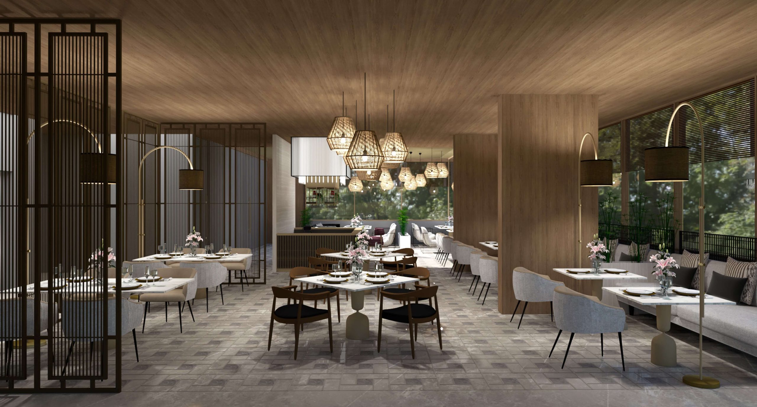
While designing any interior space, understanding the behavior of color in combination with other tones is vital. Colors can accentuate spatial characteristics, create illusions of space, alter perceptions of size, and bring balance to asymmetrical spaces. While lighter colors can make a room appear larger, darker tones can add depth and intimacy. Moreover, color can highlight architectural features, emphasize specific design elements, and create a focal point. For instance, yellow, along with burgundy, green, or brown tones, instantly brightens up a corner, proving its versatile nature. The combination of dark wood and warm yellow can facilitate an instant transformation of a space. Yellow, being the primary color, provides greater flexibility when pairing with secondary and tertiary colors.
Cultural and historical context:
Cultural and historical factors majorly influence the use of color in architecture. In some cultures, specific colors may be associated with particular meanings or symbolism. The use of color in the Indian context underscores its transformative power and highlights the importance of considering cultural and vernacular associations when selecting hues for a space. Yellow tones have been integral to vernacular designs for centuries, carrying a vintage aesthetic. From the vibrant hues of traditional clothing to the intricate patterns and designs of architecture, color is an integral part of the Indian aesthetic. The contextual phenomenon of color is not limited to a specific type of building or architectural style. Instead, it applies to all types of structures, from residential homes to commercial buildings, and from ancient temples to modern skyscrapers.
Our perception of color can vary significantly depending on the relationship between values, saturations, and the warmth or coolness of the accompanying colors. The right color palette can enhance a space by exploring its symbolic, sensory, emotive, and associative dimensions. Therefore, the use of color in architecture requires a deep understanding of human psychology and cultural symbolism. By selecting the appropriate color palette, we can create spaces that are visually appealing and emotionally, culturally, and socially relevant, thereby benefiting overall well-being.